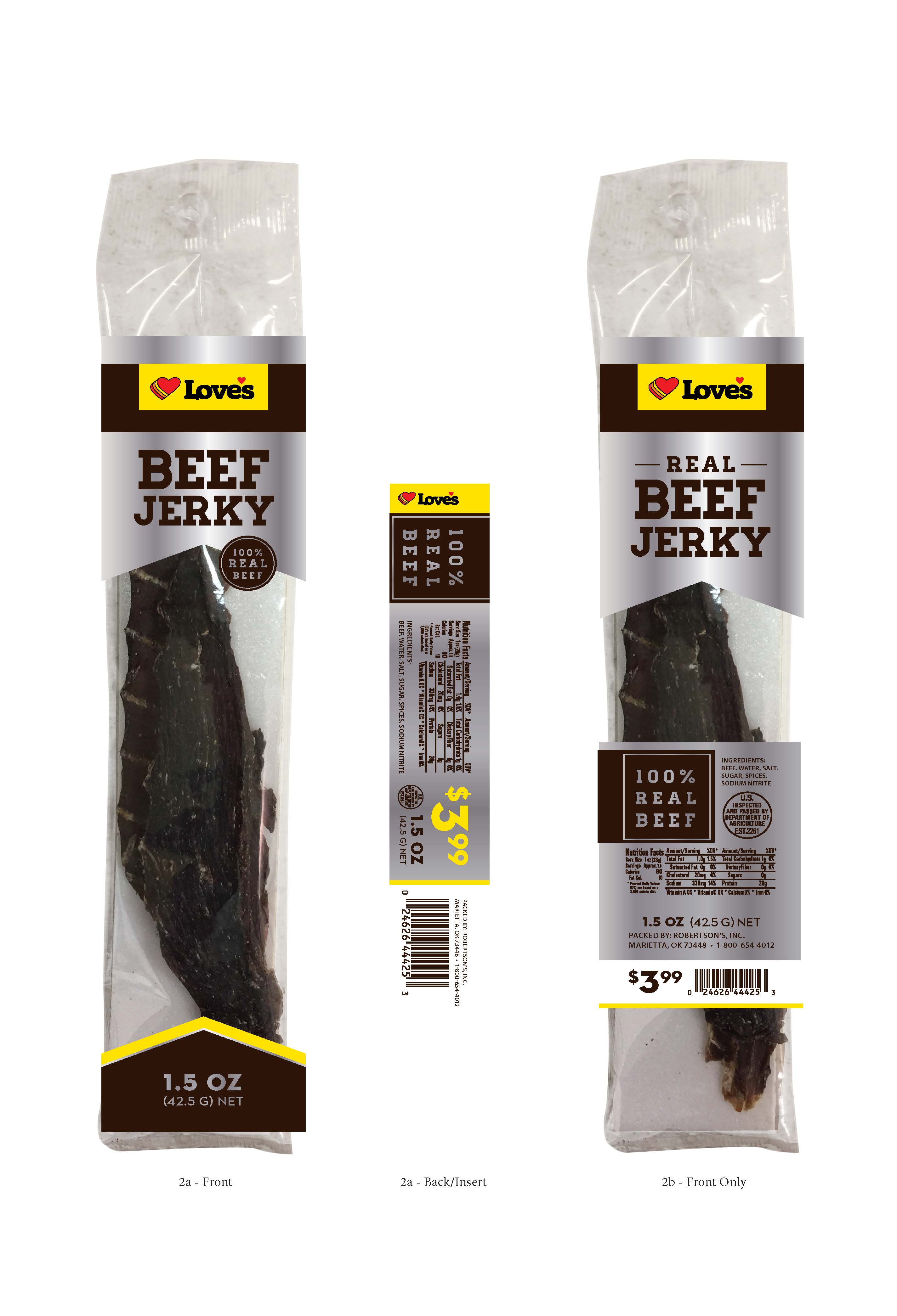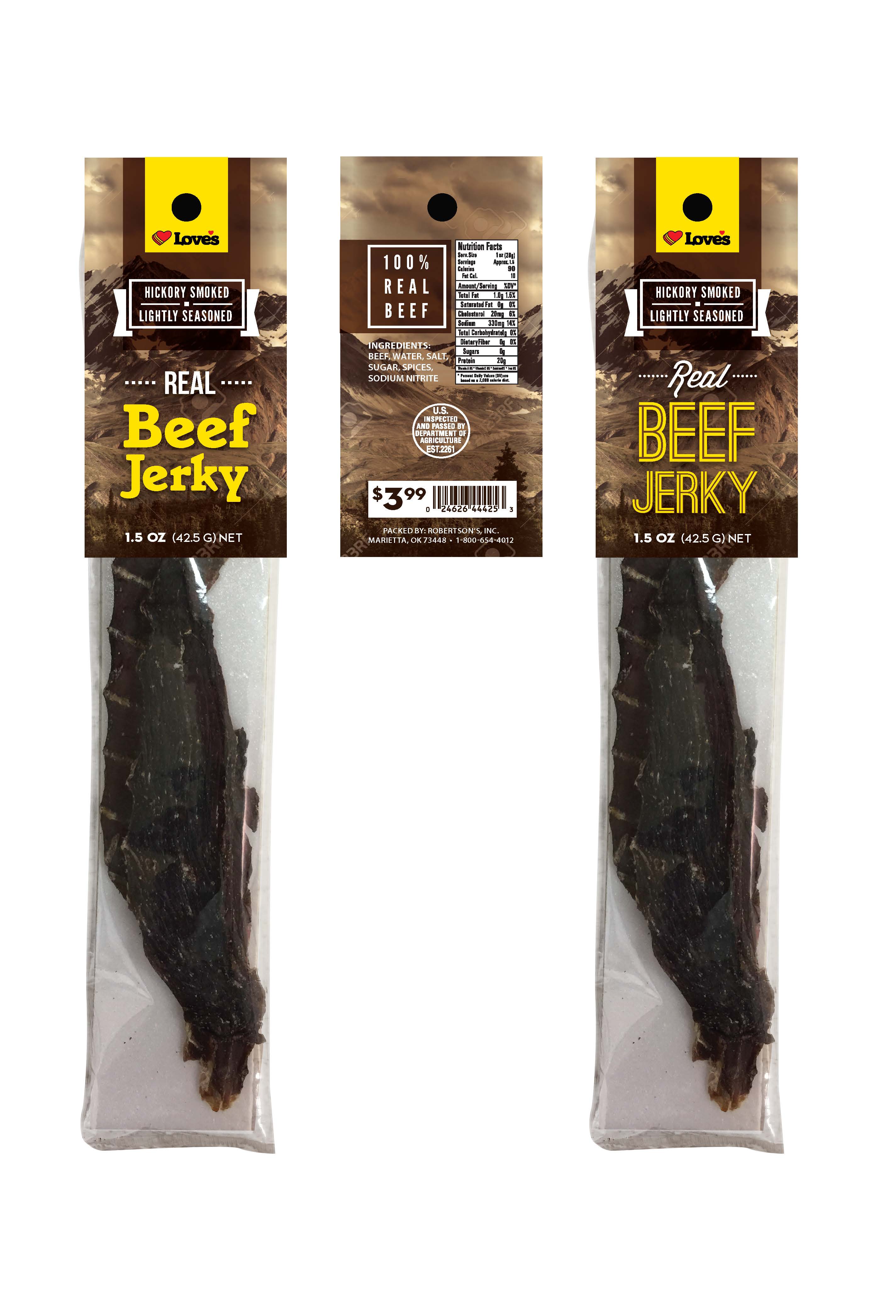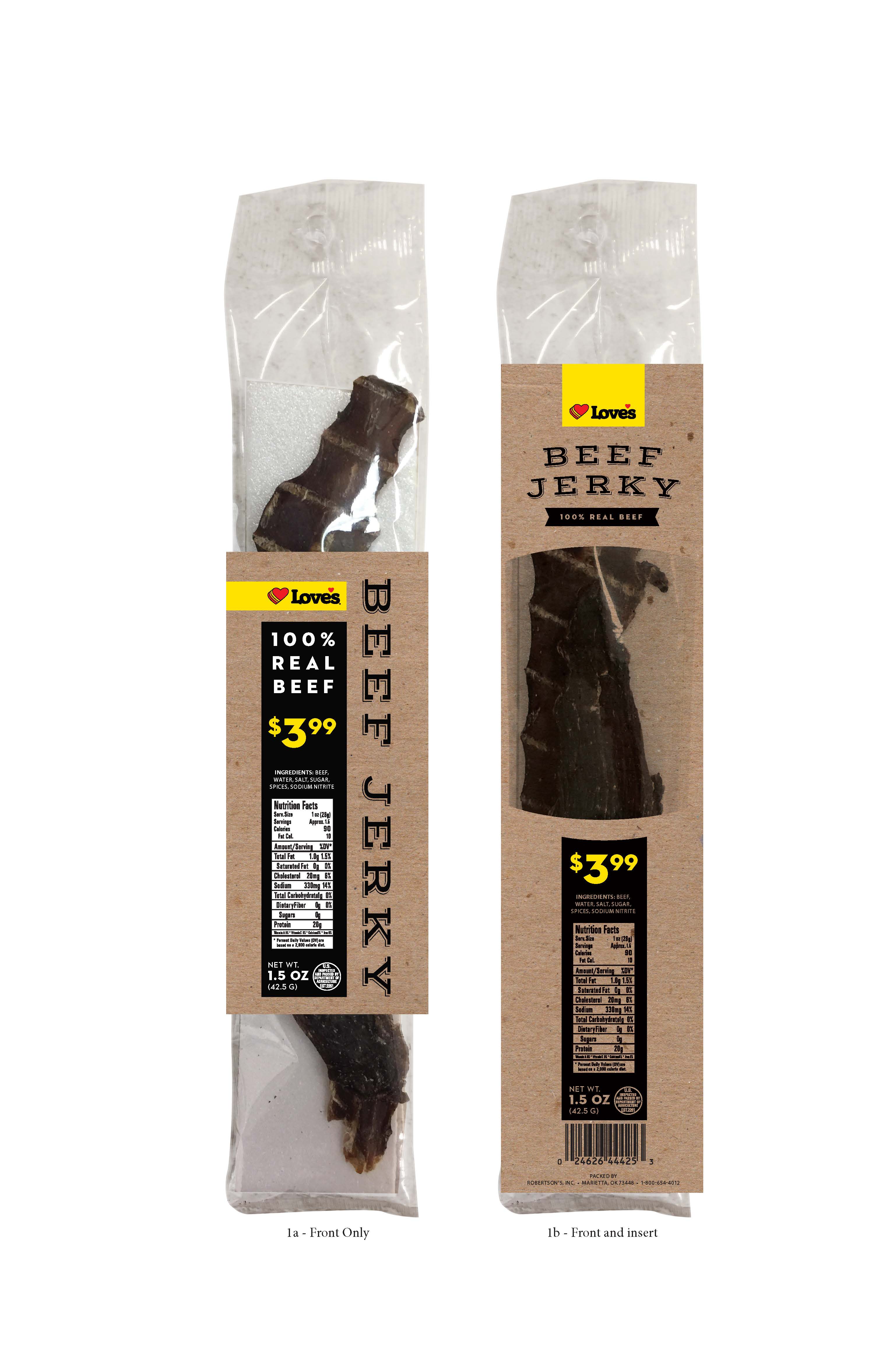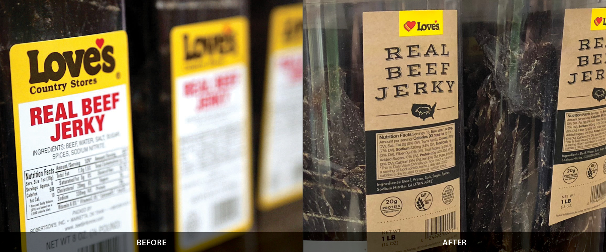
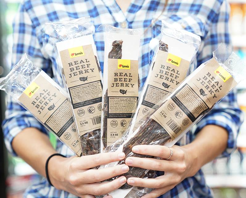
Overview
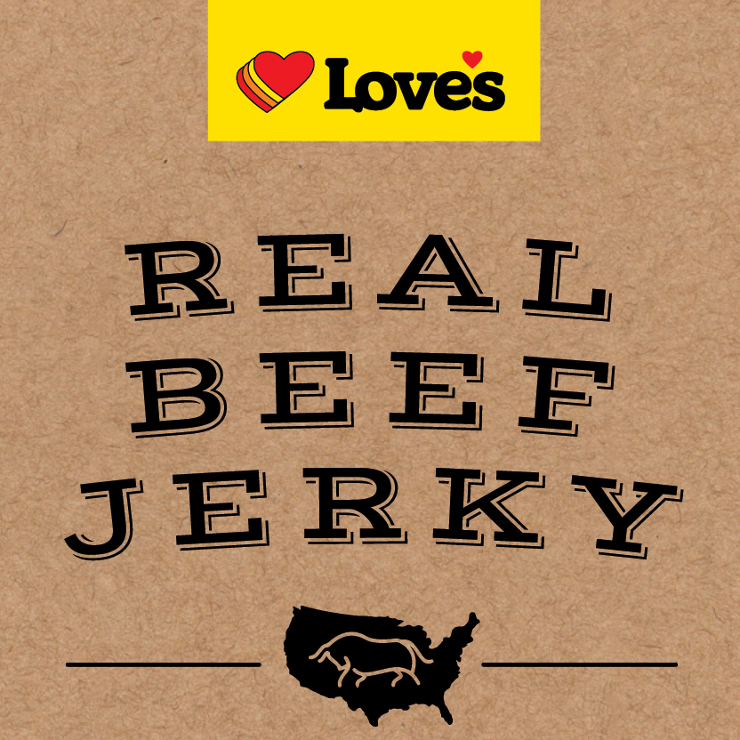
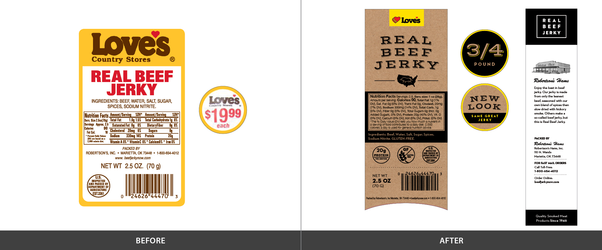
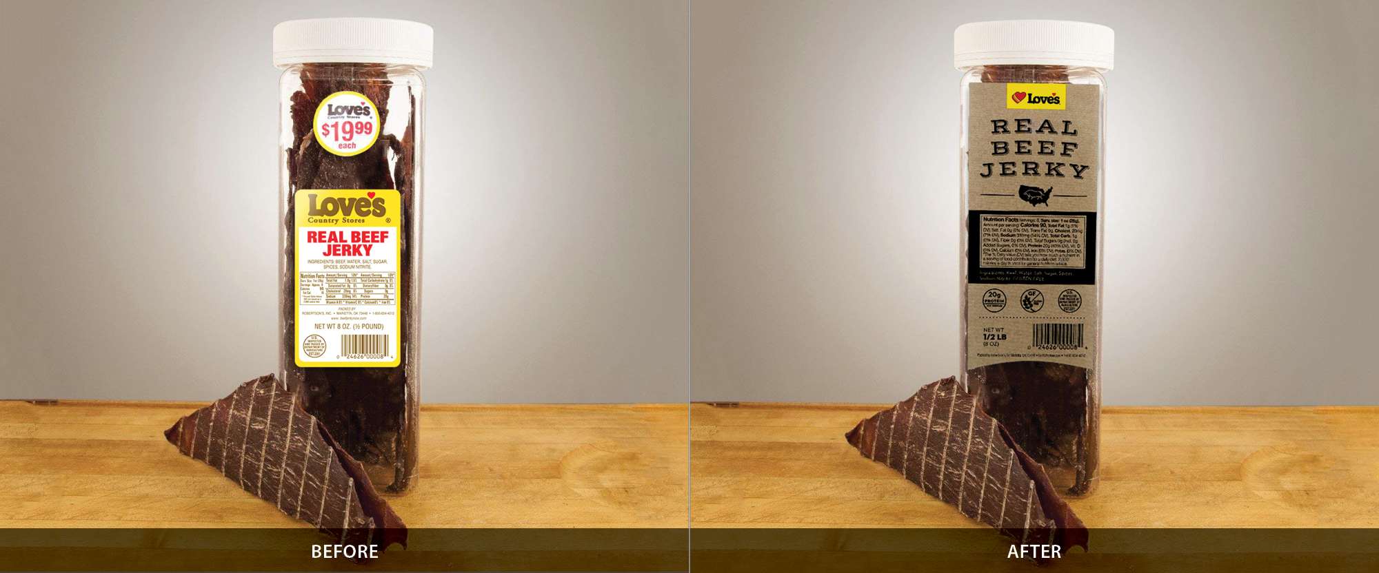
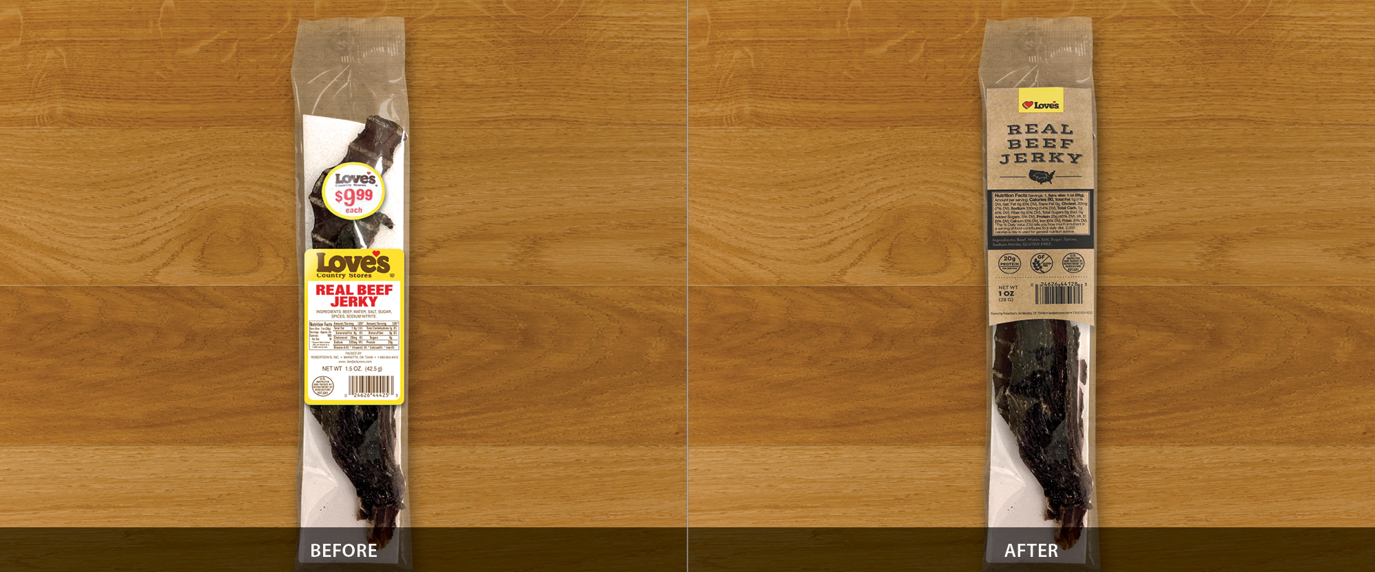
Love’s Jerky has been active for awhile and needed a refresh to look a little less dated. The idea was to keep it looking like an in-house brand, but with a modern spin. The kraft paper texture was used to illustrate this fact.
Requirements
- Uses all things present on the current labels (nutrition facts, sizes, etc)
- Labels fit the current 4 types of packaging (2 sleeves and 2 jars).
- Love’s logo shown prominently (preferably on Love’s Golden Yellow)
- Features Robertson’s manufacturer logo and information
- Works for Professional Drivers and Traveling Public alike
Design Credits
Logo/Branding, Initial Layout of all sizes: Jared Mabrey
Layout Tweaks: James Adams & Kris Kern
Earlier Concepts